
If you find yourself holding your phone at arm’s length, squinting at grey-on-grey text, or giving up on an app because you can’t read the buttons. That’s not your eyesight failing. That’s a phone shipped with default settings tuned for people with perfect vision in good lighting.
The quick answer: Android has a whole stack of readability settings, and most people only ever find one of them. Font size makes text bigger without moving anything else. Display size (sometimes called screen zoom) scales everything (buttons, icons, spacing) and it’s often the bigger win. Bold text and high contrast text fix the thin, low-contrast fonts that are genuinely hard to read regardless of size. Colour correction and colour inversion help with colour vision differences and glare. Magnification zooms into any part of the screen on demand. Then there’s brightness handling, dark mode, and per-app text scaling in browsers and reading apps. Change them one at a time and check how things actually look before stacking more on.
Here’s each one, what it does, and the trade-offs nobody mentions.
Start with font size: but know its limits
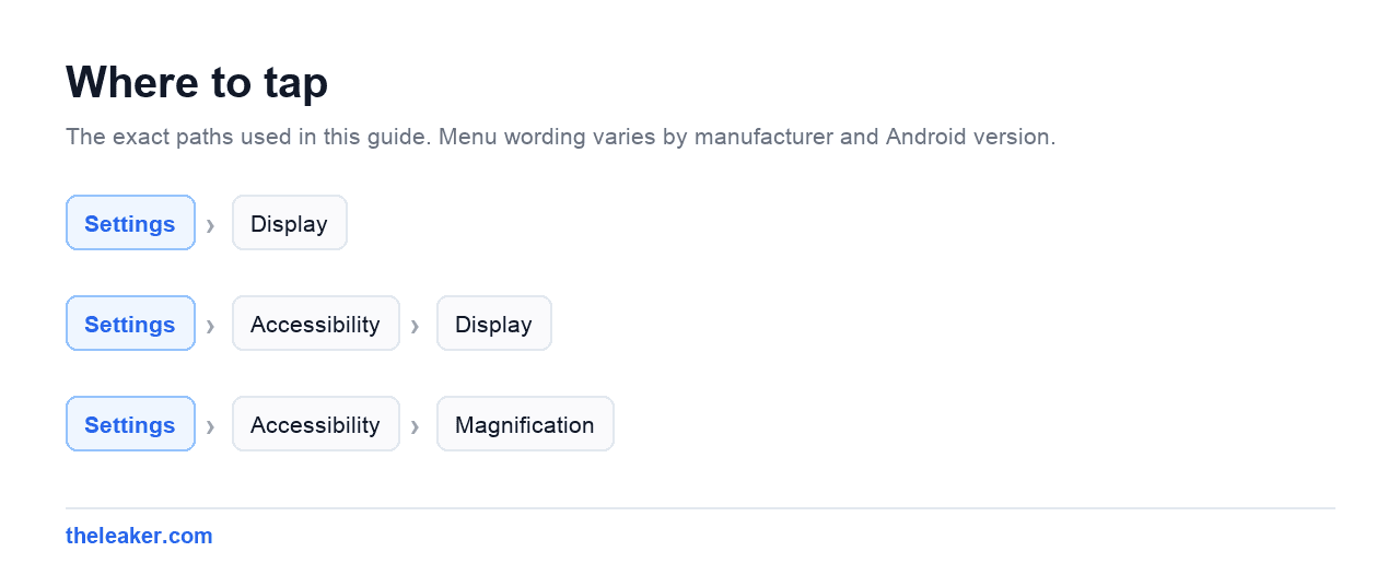
The obvious one. Go to Settings → Display and look for Font size or Font size and style. You’ll get a slider with a live preview.
Drag it up and text everywhere gets bigger. Simple, effective, and reversible in five seconds if you overshoot.
What font size doesn’t change: buttons, icons, tab bars, spacing, and anything drawn as an image rather than text. So if what you’re struggling with is hitting the right button, or seeing an icon clearly, font size alone won’t fix it.
It also has a downside people discover a few days in. Bigger text means less text fits on screen, so you scroll more. And some apps handle large text badly: labels get cut off, buttons overlap, text runs off the edge of a card. That’s the app developer’s fault, not yours, but you still have to live with it.
Practical advice: go up two or three steps, use the phone for a day, then decide whether to go further. Jumping straight to maximum usually creates more problems than it solves.
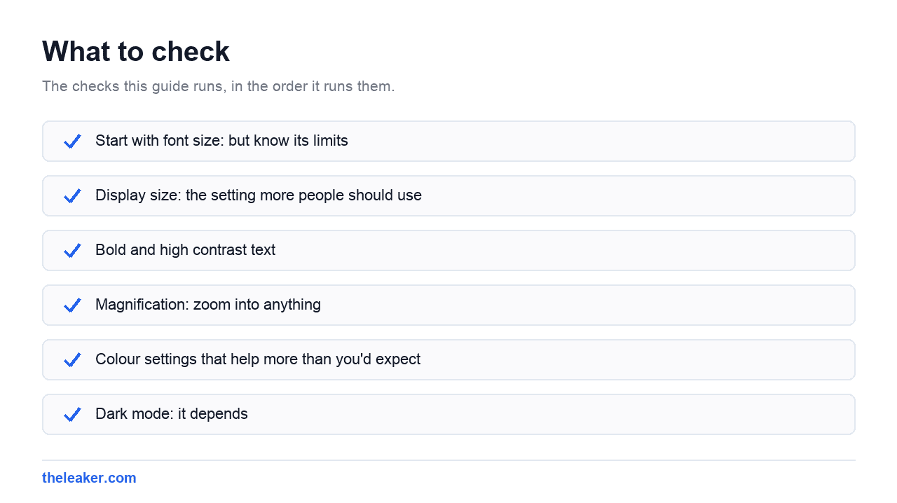
Display size: the setting more people should use
This is the one that’s often hiding one row below font size, and it does more.
Look for Display size, Screen zoom, or Display size and text in your display settings. On Samsung’s One UI it’s Settings → Display → Screen zoom. On Pixels it’s usually grouped with font size under display. Xiaomi and OnePlus have their own labels but the same idea.
Display size scales the entire interface, not just text. Buttons get bigger. Icons get bigger. Touch targets get bigger. Everything grows together, so layouts stay properly proportioned instead of text bursting out of containers.
If you’re struggling with the whole interface rather than just reading, this is a better first move than font size. Many people get the best result from a modest bump to both: one step of display size plus two steps of font size: rather than maxing out either one.
The trade-off is the same: less fits on screen. On a small phone, a large display size can make some apps feel cramped.
Bold and high contrast text
Size isn’t always the problem. Modern app design loves thin fonts in light grey on white backgrounds, and that’s hard to read for a lot of people even at large sizes.
In Settings → Accessibility → Display (the exact path varies by brand) look for:
- Bold text: thickens every font system-wide. Costs nothing in screen space and often helps more than another size step.
- High contrast text: forces text to a strong black or white with an outline, overriding those washed-out greys. It can look a bit blunt aesthetically, but readability improves noticeably.
Try bold text before you push font size any higher. It’s the most underrated readability setting on Android, and it has almost no downside.
Magnification: zoom into anything
For moments when you need to read something small and enlarging the whole system isn’t practical. A stubborn app, an image caption, tiny print in a document.
Turn it on under Settings → Accessibility → Magnification. You get a choice of how to trigger it: a floating button on screen, a shortcut gesture, or (on some devices) a triple-tap on the screen.
Once active you can magnify the full screen and pan around, or use a movable magnifier window over part of it. Pinch to adjust zoom level while it’s active.
Worth setting up even if you don’t think you’ll use it daily. It’s the tool that rescues you from the one app that ignores every other setting.
Colour settings that help more than you’d expect
Colour correction (under Accessibility) adjusts the display for red-green or blue-yellow colour vision differences. If you’ve ever lost track of which chart line is which, or missed a status indicator because red and green looked identical, try the modes here and see if one makes things click.
Colour inversion flips light and dark. It’s a heavier hammer than dark mode. It inverts everything, including photos, which look strange. But for reading long stretches of text with light sensitivity, some people find it far more comfortable than anything else.
Reduce transparency / reduce motion options, where available, kill the translucent panels and sliding animations that make text harder to track. If moving interfaces make you dizzy or lose your place, these help.
Dark mode: it depends
Dark mode gets recommended universally, and it shouldn’t be. It helps some people and actively hurts others.
If you have astigmatism, which is very common, light text on a dark background can appear to smear or halo, making reading harder rather than easier. If that describes what you see, stick with light mode and turn the brightness down instead.
Where dark mode does reliably help is night reading in a dark room, where a bright white screen is uncomfortable regardless of eyesight. Pair it with a warm-tone night filter and low brightness.
Try it for a few days and judge by whether reading feels easier, not by what you’ve been told is better.
Brightness is a readability setting
People fiddle with fonts while ignoring the thing that most affects legibility.
Adaptive brightness is meant to handle this automatically, and mostly does, but it learns from your adjustments. If it consistently leaves the screen too dim for you, keep manually correcting it and it will adapt over time.
Outdoors is the real test. If you can’t read your screen in sunlight, check whether your phone has an extra brightness boost or high brightness mode, usually a toggle near the brightness slider. It drains battery and generates heat, so it’s for when you need it, not all day.
And there’s a simple physical fix people skip: a badly scratched or greasy screen protector scatters light and destroys contrast. Clean the screen properly. Replace a beaten-up protector. That can help more than any setting.
Per-app settings worth knowing
System settings don’t reach everywhere, and some apps have their own controls that work better.
Browsers usually have their own text scaling in settings, plus a simplified reading view that strips ads, sidebars and clutter to leave clean text at a comfortable size. If you read a lot of articles on your phone, reading view is the single biggest improvement available.
Reading and news apps nearly always let you set font size, font family, line spacing and background colour independently. Increasing line spacing helps a lot and almost nobody tries it.
Messaging apps often have their own chat font size setting separate from the system one.
Keyboards can usually be made taller, with larger keys: worth doing if typos are the real problem rather than reading.
When you’d rather listen than read
Sometimes the best fix for hard-to-read text is not reading it.
Select to Speak (in Accessibility) lets you tap a button, then select text on screen and have it read aloud. It’s lighter and simpler than a full screen reader, and useful for anyone, not just people with vision loss.
Most browsers and reading apps also have a listen or read-aloud function built in, which handles long articles well.
Don’t change everything at once
The most common mistake: turning on eight settings in one session, ending up with a phone that looks broken, and switching it all back off in frustration.
Change one thing. Use the phone normally for a day. Notice whether it actually helped. Then change the next thing.
A sensible order for most people: bold text first (free, no layout cost), then one step of display size, then font size as needed, then high contrast text if greys are still a problem, then set up magnification as a backstop.
If your phone starts feeling sluggish while you’re adjusting things, that’s unrelated: some of the fixes are in our guide to hidden Android settings that speed up your phone.
Frequently asked questions
What’s the difference between font size and display size?
Font size only scales text, leaving buttons, icons and layout unchanged. Display size scales the whole interface proportionally: text, buttons, icons and spacing together. If reading is your only issue, font size is enough. If tapping the right thing is also hard, display size is the better tool.
Why does text look broken in some apps after I increase font size?
Because the app wasn’t built to handle large text. Labels get cut off, buttons overlap, text overflows its container. It’s the app’s shortcoming, not a fault in your phone. Try a smaller font step combined with display size, or check whether the app has its own text setting.
Is dark mode better for your eyes?
Not universally. It helps in dark rooms and for people sensitive to bright screens. But for people with astigmatism, light text on dark backgrounds can blur or halo, making reading harder. Try both for a few days and go with what feels easier, not with the popular recommendation.
Can I make text bigger in just one app?
Often, yes. Browsers, reading apps, messaging apps and ebook apps commonly include their own text size controls in their settings, independent of the system setting. That’s the cleanest option when only one app is a problem. You leave the rest of your phone alone.
Related: Type Twice as Fast: Gboard Tricks Most People Never Find

Hello, folks, my name is Akshay, and from the beginning, I like to play with the latest phones, gaming consoles, PCs, Laptops’s and whatnot. When I get spare time, I like to do Photography, and you will always find me playing with Photoshop, Lightroom, Premiere Pro, etc. In Love with Gadgets, my gear Motorola Moto G5 Plus. You can contact him on akshaydua[@]theleaker.com.